June 28th, 2012 in Daily, Projects
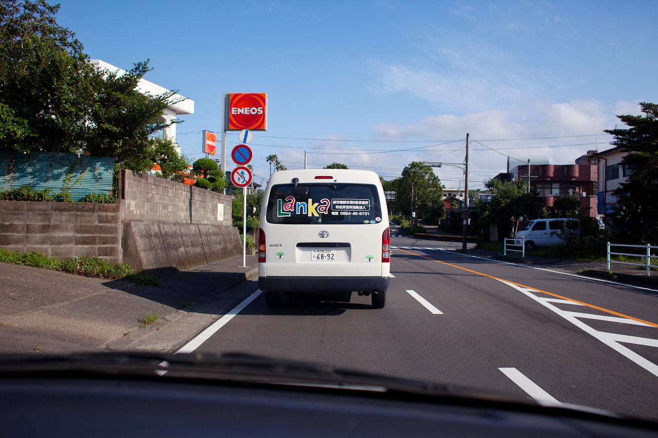
Pulled up behind a Lanka truck, a logo I helped art direct with my friend Taku
Lanka is a company which helps place adults with disabilities into work situations where they can excel. Really great purpose and from what I can tell they have been able to do this quite successfully, which can be difficult in a society that can be quite harsh and judgmental towards those who are “different”.
In the end I guess the decided to add colors into the design, which I don’t necessarily agree with… as the organization is focused on empowering people who have difficult circumstances to deal with, they shouldn’t really come off as “cute” or “childish”, but rather more professional. It is kind and welcoming, but the colors could also signify a daycare facility, which I think they definitely are not.


